今回は「Power Apps」で、より高機能なアプリを作るために、「Power Apps Component Framework(略称PCF)」を利用したコードコンポーネントの作成方法について解説していきます。
Power Appsでは、「キャンバスアプリ」と「モデル駆動アプリ」の2つの形式のアプリケーションを作成することが可能です。それぞれのアプリケーションの作成方法が大きく異なりますが、どちらもUI部品である「コンポーネント」を使用して作成していきます。
特に、「キャンバスアプリ」はその柔軟性から多くのユーザーに支持されており、標準コンポーネントを活用して多様な機能を持つアプリケーションを簡単に作成できます。
非常に柔軟性の高い「キャンバスアプリ」ですが、標準コンポーネントに含まれていない「Chart」や「Grid」などの高度なUIを持つアプリケーションを作成する場合には、独自機能を実装した「コードコンポーネント」とよばれるカスタムコンポーネントを追加する必要があります。
今回の記事では、高機能なアプリ作成に欠かせない「コードコンポーネント」の作成手順について詳しく解説していきます。
目次
Power Apps Component Framework
「コードコンポーネント」の作成にあたり欠かせないものが、「Power Apps Component Framework(略称PCF)」です。このフレームワークは、UI機能をコードで実装するためのもので、開発言語としてJavaScriptまたはTypeScriptを利用します。さらに、このフレームワークは、「React」といったJSフロントエンドフレームワークにも対応しており、より高度なユーザーインターフェースを持ったコンポーネントを作成することが可能です。
事前準備
今回は以下の開発環境を使用します。
- Visual Studio Code
- Npm or Node.JS ※ LTS (長期サポート) バージョンのご利用をお勧め
- Power Apps CLI(Power Apps Component Frameworkを利用する為のツール)
Power Platform CLIを使用しプロジェクト作成
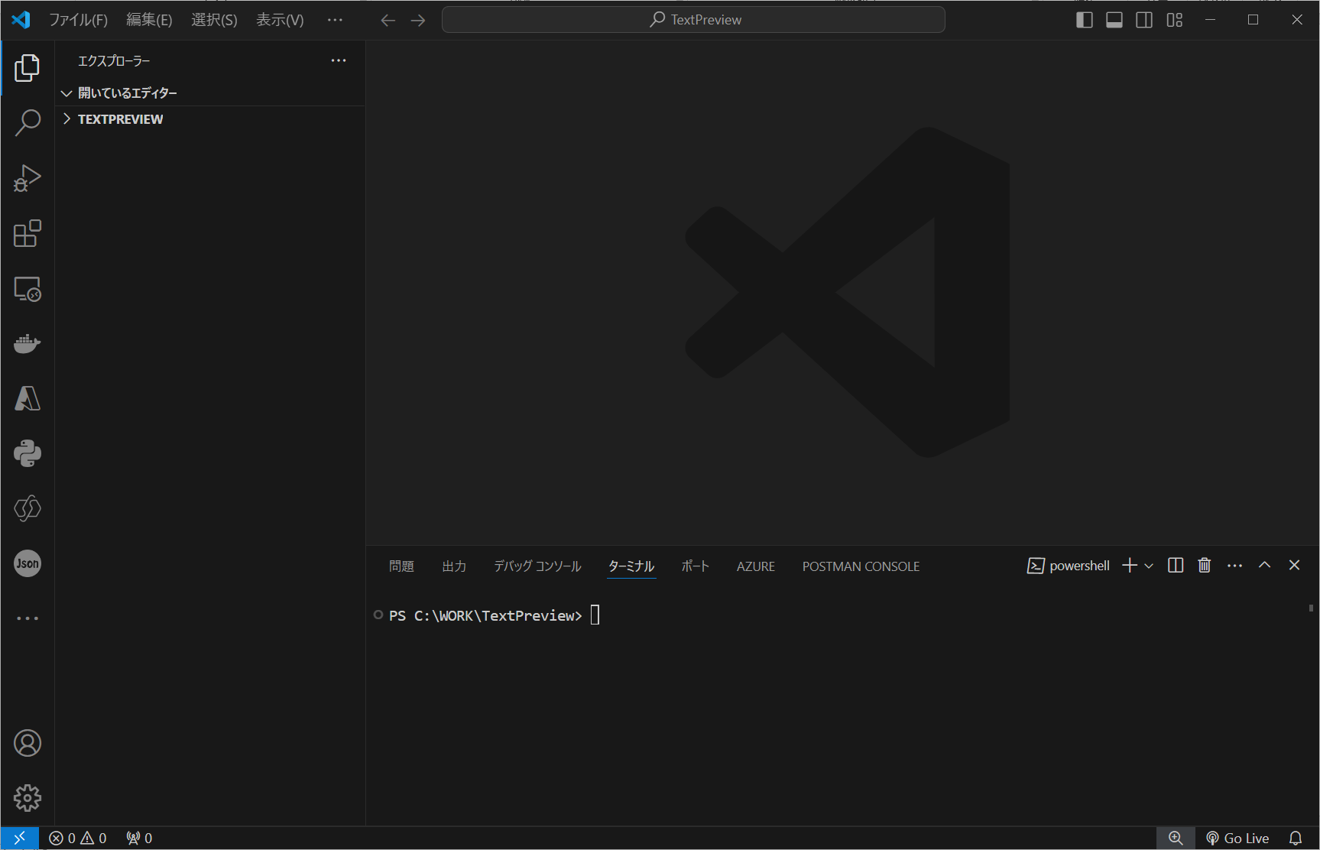
それでは、早速コードコンポーネントの作成を行っていきます。まずはじめにコードコンポーネントのプロジェクトを作成します。プロジェクトの作成あたり、事前に任意のフォルダを作成しておきます。今回は「TextPreview」というフォルダを作成しました。
続いて、以下のように、作成したフォルダをVisual Studio Codeで開きます。さらに、ターミナルも起動しておきます。
その後、ターミナル上で以下のコマンドを実行し、PCFプロジェクト作成します。
今回はフレームワークにReactを使用するプロジェクトを作成していきます。
pac pcf init -n TextPreviewPCF -ns TPNameSpace -t field -fw react -npmコマンドを実行すると、次のようにプロジェクトフォルダが作成され、続いてコマンドオプション「-npm」に基づいて、npm installが実行されます。
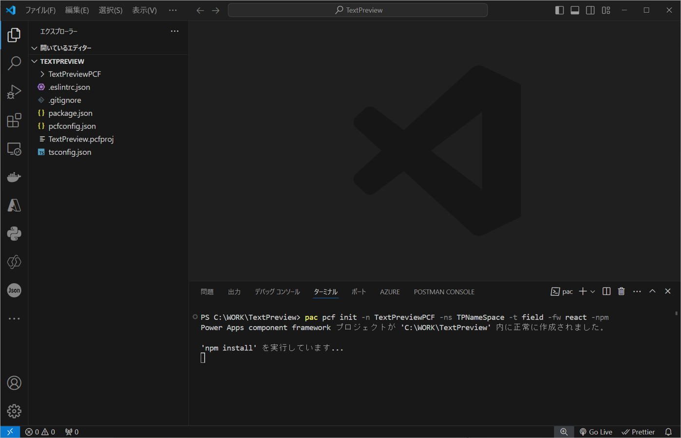
npm installが完了すれば、PCFプロジェクトの作成と、必要なパッケージのインストールは完了です。
プロジェクトフォルダの確認
作成されたプロジェクトフォルダを確認すると、以下のようにコマンドを実行した、配下に「TextPreviewPCF」というフォルダ作成されています。
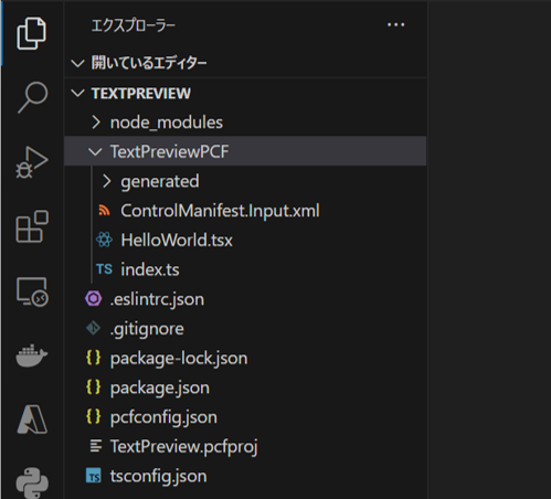
作成されたファイルはそれぞれ以下の様な役割を持っています。
| ファイル/フォルダ | 用途 |
|---|---|
| ControlManifest.Input.xml | コンポーネントのマニフェストファイル、コンポーネントの名前、参照するjs、cssなどのリソースや、プロパティ定義など、コンポーネントの重要な構成を設定するファイルです。 |
| (HelloWorld).tsx | UIコンポーネントを記述する際に使用するファイルです。 こちらのファイルにメインコードを実装します。ファイル名は用途に応じて変更可能です。 |
| index.ts | コンポーネントのエントリ部分となります。PCFでは、予め決められたメソッドが用意されており、必要に応じコードを追加します。 |
| generated | マニフェストファイルに基づき自動で生成される型定義ファイル「ManifestTypes.d.ts」が格納されています。 |
今回は表で示したファイルを編集し、新たに「テキストボックス」に入力された値をそのまま表示専用の「ラベル」のように出力するコンポーネントを作成したいと思います。
プロパティ定義
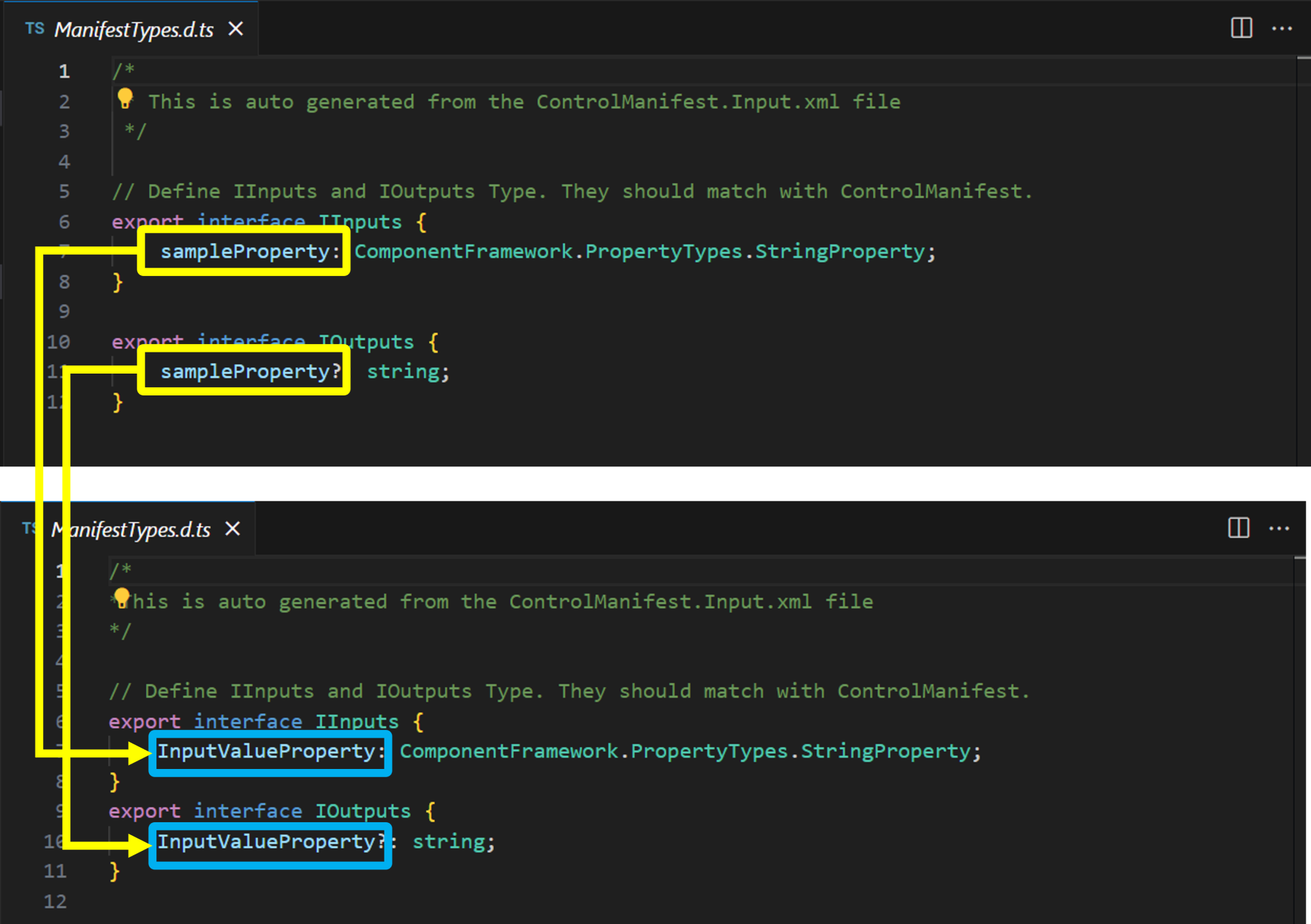
コンポーネントにあらかじめ用意されたプロパティを変更するため、「ControlManifest.Input.xml」を編集してプロパティ定義を行っていきます。初期値として設定されている「sampleProperty」のプロパティ定義を、以下の強調表示されたコードに書き換えます。
<?xml version="1.0" encoding="utf-8" ?>
<manifest>
  <control namespace="TPNameSpace" constructor="TextPreviewPCF" version="0.0.1" display-name-key="TextPreviewPCF" description-key="TextPreviewPCF description" control-type="virtual" >
    <!--external-service-usage node declares whether this 3rd party PCF control is using external service or not, if yes, this control will be considered as premium and please also add the external domain it is using.
    If it is not using any external service, please set the enabled="false" and DO NOT add any domain below. The "enabled" will be false by default.
    Example1:
      <external-service-usage enabled="true">
        <domain>www.Microsoft.com</domain>
      </external-service-usage>
    Example2:
      <external-service-usage enabled="false">
      </external-service-usage>
    -->
    <external-service-usage enabled="false">
      <!--UNCOMMENT TO ADD EXTERNAL DOMAINS
      <domain></domain>
      <domain></domain>
      -->
    </external-service-usage>
    <!-- property node identifies a specific, configurable piece of data that the control expects from CDS -->
<property name="InputValueProperty" display-name-key="InputValueProperty_Display_Key" description-key="InputValueProperty_Desc_Key" of-type="Multiple" usage="bound" required="true" />
    <!--
      Property node's of-type attribute can be of-type-group attribute.
      Example:
      <type-group name="numbers">
        <type>Whole.None</type>
        <type>Currency</type>
        <type>FP</type>
        <type>Decimal</type>
      </type-group>
      <property name="sampleProperty" display-name-key="Property_Display_Key" description-key="Property_Desc_Key" of-type-group="numbers" usage="bound" required="true" />
    -->
    <resources>
      <code path="index.ts" order="1"/>
      <platform-library name="React" version="16.8.6" />
      <platform-library name="Fluent" version="8.29.0" />
      <!-- UNCOMMENT TO ADD MORE RESOURCES
      <css path="css/TextPreviewPCF.css" order="1" />
      <resx path="strings/TextPreviewPCF.1033.resx" version="1.0.0" />
      -->
    </resources>
    <!-- UNCOMMENT TO ENABLE THE SPECIFIED API
    <feature-usage>
      <uses-feature name="Device.captureAudio" required="true" />
      <uses-feature name="Device.captureImage" required="true" />
      <uses-feature name="Device.captureVideo" required="true" />
      <uses-feature name="Device.getBarcodeValue" required="true" />
      <uses-feature name="Device.getCurrentPosition" required="true" />
      <uses-feature name="Device.pickFile" required="true" />
      <uses-feature name="Utility" required="true" />
      <uses-feature name="WebAPI" required="true" />
    </feature-usage>
    -->
  </control>
</manifest>
書き換え後、型定義ファイル「ManifestTypes.d.ts」を更新する為、以下のコマンドをターミナル上で実行し、一度ビルドします。
npm run buildビルド実行後、以下の用に型定義ファイルが更新されます。
tsxファイルの更新
続いて、UIコンポーネントを実装する「tsx」ファイルを更新していきます。まずファイル名を「HelloWorld」から「App」へ変更します。その後ファイル内を以下のように書き換えます。
import * as React from 'react';
import { Label } from '@fluentui/react';

export interface ITextPreviewSampleProps {
  InputValue?: string;
  InputValueChanged?: (newValue: string) => void;
}

export class TextPreviewSample extends React.Component<ITextPreviewSampleProps,{InputValue: string}> {
  constructor(props: ITextPreviewSampleProps) {
    super(props);
    this.state = {
      InputValue: String(this.props.InputValue),
    };
  }

  public render(): React.ReactNode {
    const {InputValue} = this.state;
    return (
      <Label>
        <textarea cols={30} rows={5} value={InputValue}  onChange={this.onInputValueChange} />
        <p>{InputValue} </p>
      </Label>
    )
  }

  private onInputValueChange = (e: React.ChangeEvent<HTMLTextAreaElement>) => {
    const newValue = e.target.value;
      this.setState(
        prevState => (
          {
            InputValue: newValue
          }
        )
      );
      if (this.props.InputValueChanged) {
        this.props.InputValueChanged(newValue);
      }
  };
}
複数行の入力が可能な「textarea」で入力欄を設け、変更された値を<p>タグで出力するという簡単な機能を上記コードで実装しています。
index.tsファイルの更新
「tsx」ファイルの変更後、「index.ts」ファイルも以下の強調表示箇所を更新します。
import { IInputs, IOutputs } from "./generated/ManifestTypes";
import { TextPreviewSample, ITextPreviewSampleProps } from "./App";
import * as React from "react";

export class TextPreviewPCF implements ComponentFramework.ReactControl<IInputs, IOutputs> {
    private theComponent: ComponentFramework.ReactControl<IInputs, IOutputs>;
    private notifyOutputChanged: () => void;
    private props:ITextPreviewSampleProps={
        InputValueChanged:this.InputValueChanged.bind(this),
    };


    /**
     * Empty constructor.
     */
    constructor() { }

    /**
     * Used to initialize the control instance. Controls can kick off remote server calls and other initialization actions here.
     * Data-set values are not initialized here, use updateView.
     * @param context The entire property bag available to control via Context Object; It contains values as set up by the customizer mapped to property names defined in the manifest, as well as utility functions.
     * @param notifyOutputChanged A callback method to alert the framework that the control has new outputs ready to be retrieved asynchronously.
     * @param state A piece of data that persists in one session for a single user. Can be set at any point in a controls life cycle by calling 'setControlState' in the Mode interface.
     */
    public init(
        context: ComponentFramework.Context<IInputs>,
        notifyOutputChanged: () => void,
        state: ComponentFramework.Dictionary
    ): void {
        this.notifyOutputChanged = notifyOutputChanged;
    }

    /**
     * Called when any value in the property bag has changed. This includes field values, data-sets, global values such as container height and width, offline status, control metadata values such as label, visible, etc.
     * @param context The entire property bag available to control via Context Object; It contains values as set up by the customizer mapped to names defined in the manifest, as well as utility functions
     * @returns ReactElement root react element for the control
     */
    public updateView(context: ComponentFramework.Context<IInputs>): React.ReactElement {
        this.props = { InputValue: String(context.parameters.InputValueProperty.raw)};
         return React.createElement(
            TextPreviewSample,
            {
                InputValue:this.props.InputValue,
                InputValueChanged:this.InputValueChanged.bind(this)
            }
         );
    }

    private InputValueChanged(newValue: string) {
		if (this.props.InputValue !== newValue) {
			this.props.InputValue = newValue;
			this.notifyOutputChanged();
		}
	}

    /**
     * It is called by the framework prior to a control receiving new data.
     * @returns an object based on nomenclature defined in manifest, expecting object[s] for property marked as "bound" or "output"
     */
    public getOutputs(): IOutputs {
        return {
            InputValueProperty:this.props.InputValue
        };
    }

    /**
     * Called when the control is to be removed from the DOM tree. Controls should use this call for cleanup.
     * i.e. cancelling any pending remote calls, removing listeners, etc.
     */
    public destroy(): void {
        // Add code to cleanup control if necessary
    }
}
「App.tsx」で変更したコードに対応するように、「updateView」メソッドを更新します。また、「getOutputs」メソッドで変更されたプロパティ値を返却できるようにコードを追加します。
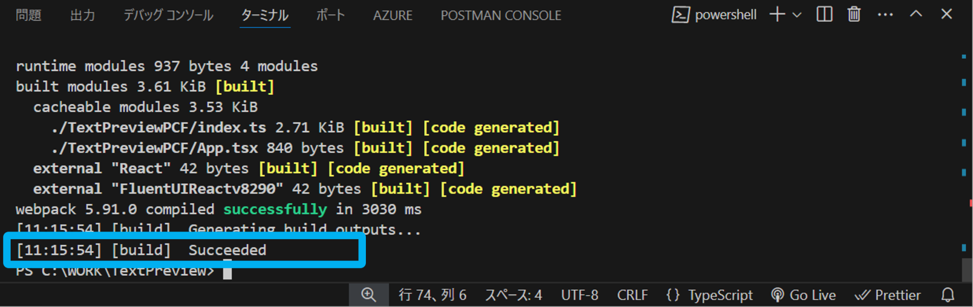
ここまでで、コードの記述が終わりましたので、先ほどと同様にnpm run buildでビルドしてみます。次のように「[build] Succeeded」となれば成功です。
動作確認
ビルドが完了しましたので、続いて動作確認を行います。以下のコマンドを実行すると、Webブラウザが起動し、作成したコンポーネントの動作を確認できます。
npm start テキストボックスの下に入力した値がリアルタイムで出力されています。さらに、サイドバーのプロパティ値もリアルタイムで更新されていることが確認できます。先ほど実装したコードがコンポーネントとして正常に動作し、コードコンポーネントが作成出来ました。
さいごに
今回は、「Power Apps」アプリへ高度なUI機能を追加することができる、「コードコンポーネント」の作成方法についてご紹介しました。次回の記事では作成したコードコンポーネントを「Power Apps」環境へアップする方法や、OSSライブラリを利用して、コードコンポーネントをさらに機能拡張する方法についてもご紹介しますので、ぜひ、そちらもご覧ください。
当社では、コードコンポーネント上で使用できるJavaScriptライブラリを提供しています。「Power Apps」アプリケーションを高機能化されたい方は是非Webサイトをご確認ください。
編集部ピックアップでは、「Power Apps」をはじめとした「Power Platform」関連の情報を公開しています。今後も継続して「Power Platform」関連情報をご紹介していきます。